Brief Report - (2025) Volume 16, Issue 4
Received: 01-Jul-2025, Manuscript No. jhmi-26-178852;
Editor assigned: 03-Jul-2025, Pre QC No. P-178852;
Reviewed: 17-Jul-2025, QC No. Q-178852;
Revised: 22-Jul-2025, Manuscript No. R-178852;
Published:
29-Jul-2025
, DOI: 10.37421/2157-7420.2025.16.600
Citation: Morgan, Rebecca L.. ”Health Data Visualization: From Insights to Interventions.” J Health Med Informat 16 (2025):600.
Copyright: © 2025 Morgan L. Rebecca This is an open-access article distributed under the terms of the Creative Commons Attribution License, which permits unrestricted use, distribution and reproduction in any medium, provided the original author and source are credited.
Effective health data visualization is paramount for transforming raw clinical information into actionable insights that enhance clinical decision-making. The array of techniques employed spans from straightforward charts and graphs to sophisticated interactive dashboards, each designed to illuminate trends, pinpoint anomalies, and support comprehensive patient management. The overarching objective is to render complex data readily understandable, enabling clinicians to swiftly ascertain patient status, forecast outcomes, and optimize therapeutic strategies, ultimately leading to elevated patient care and improved operational efficiency within healthcare systems [1].
Interactive dashboards stand out as a potent instrument in contemporary health data visualization. These tools empower clinicians to explore data dynamically, allowing for filtering based on specific patient demographics or conditions and enabling drill-downs into detailed information. This interactive capability fosters a more profound comprehension of disease patterns and treatment efficacy. When meticulously designed, these dashboards can substantially diminish cognitive load and expedite the diagnostic and therapeutic processes, thereby promoting more informed and timely clinical judgments [2].
Geospatial visualization techniques offer a distinctive perspective on public health trends and the geographical distribution of diseases. By superimposing health data onto geographical maps, clinicians and public health officials gain the ability to identify disease hotspots, discern environmental influences on health outcomes, and strategically plan targeted interventions. This geographical approach proves particularly valuable for managing infectious diseases and understanding health disparities across diverse regions [3].
Time-series analysis and its corresponding visualization are foundational for meticulously tracking patient health status over extended periods. This encompasses the continuous monitoring of vital signs, the progression of diseases, and the efficacy of treatment responses. Visualization methodologies such as line charts, area charts, and heatmaps are adept at depicting trends and identifying critical shifts. Such visual representations enable clinicians to anticipate potential health issues, proactively adjust treatment protocols, and accurately evaluate the long-term impact of interventions [4].
Network visualization techniques are instrumental in uncovering intricate relationships within health data, including but not limited to protein-protein interactions, the co-occurrence of diseases, and patient-provider networks. These visualizations assist researchers and clinicians in understanding complex biological pathways and epidemiological connections. By illustrating these relationships, the identification of key nodes, the comprehension of system dynamics, and the pinpointing of potential intervention targets become significantly more accessible [5].
The integration of machine learning within health data analysis frequently necessitates the use of advanced visualization techniques to effectively interpret model outputs. Visualizing elements such as feature importance, prediction probabilities, and cluster analyses provides clinicians with a clear understanding of the rationale behind a model's recommendations. This transparency is crucial for building trust in AI-driven insights and facilitating their seamless integration into daily clinical practice, thereby enhancing the accuracy and reliability of clinical decisions [6].
Patient-specific data visualization, encompassing elements like personalized risk scores or tailored treatment response summaries, serves to empower both clinicians and patients. When these visualizations are presented with clarity and precision, they significantly contribute to shared decision-making processes, improve patient adherence to prescribed treatments, and foster a greater overall engagement in the patient's own health journey. This individualized approach cultivates a more collaborative and effective relationship between healthcare providers and their patients [7].
The visualization of high-dimensional omics data, such as genomic and proteomic information, presents considerable challenges. Advanced techniques, including heatmaps, circos plots, and dimensionality reduction methods like t-SNE and UMAP, are indispensable for identifying subtle patterns and potential biomarkers within this complex data. These visualizations are critical for gaining a molecular-level understanding of disease mechanisms and for the development of precise, personalized medicine strategies [8].
Rigorous assessment is essential for evaluating the true effectiveness of health data visualization techniques. Studies frequently adopt user-centered design principles and employ comprehensive usability testing to ensure that visualizations are not only intuitive and accurate but also contribute positively to existing clinical workflows. Key metrics, such as task completion time, error rates, and overall user satisfaction, are utilized to refine visualization designs for maximum impact on clinical decision-making processes [9].
Ethical considerations are of utmost importance when dealing with the visualization of health data, with particular emphasis on safeguarding patient privacy and ensuring robust data security. Specific techniques must be meticulously employed to anonymize sensitive information while concurrently retaining its analytical utility. Moreover, the responsible and accurate presentation of data is critical to preclude misinterpretations that could potentially lead to suboptimal clinical decisions. Ultimately, transparency and accountability in both data handling and visualization practices are fundamental requirements [10].
Effective health data visualization is a cornerstone for transforming raw clinical information into actionable insights, thereby significantly enhancing clinical decision-making capabilities. The spectrum of visualization techniques is broad, encompassing simple charts and graphs as well as sophisticated interactive dashboards. Each method serves the critical function of highlighting trends, identifying anomalies, and facilitating effective patient management. The core objective is to make complex data easily comprehensible at a glance, empowering clinicians to quickly grasp a patient's current status, predict potential future outcomes, and optimize treatment plans, ultimately leading to improvements in patient care and operational efficiency within healthcare systems [1].
Interactive dashboards represent a powerful advancement in modern health data visualization tools. They provide clinicians with the ability to explore data dynamically, allowing for the filtering of information by specific patient demographics or medical conditions, and enabling deeper dives into detailed data points. This dynamic interactivity cultivates a more profound understanding of disease patterns and the effectiveness of various treatments. When designed with a focus on usability and clarity, these dashboards can substantially reduce the cognitive burden on clinicians and accelerate the diagnostic and therapeutic processes, leading to more informed and timely clinical judgments [2].
Geospatial visualization techniques offer unique and valuable insights into public health trends and the geographical distribution of diseases. By mapping health data onto specific geographical locations, clinicians and public health officials can effectively identify areas with high disease prevalence (hotspots), understand the impact of environmental factors on health outcomes, and develop targeted interventions for specific regions. This geographical approach is particularly beneficial for managing infectious diseases and understanding health disparities that may exist across different areas [3].
Time-series analysis and visualization are fundamental for tracking the evolution of a patient's health status over time. This includes the continuous monitoring of vital signs, disease progression, and the patient's response to treatments. Techniques like line charts, area charts, and heatmaps are highly effective in illustrating trends and identifying crucial changes in a patient's condition. These visual representations allow clinicians to anticipate potential health issues, adjust treatment protocols proactively, and accurately evaluate the long-term effects of medical interventions [4].
Network visualization plays a crucial role in revealing complex interrelationships within health data, such as the interactions between proteins, the co-occurrence of various diseases, or the networks formed by patients and healthcare providers. These visualizations aid researchers and clinicians in comprehending intricate biological pathways and epidemiological connections. By visually representing these relationships, it becomes easier to identify key components, understand the dynamics of complex systems, and pinpoint potential targets for therapeutic intervention or further research [5].
The application of machine learning in health data analysis often demands sophisticated visualization techniques to interpret the outcomes of these models. Visualizing aspects such as feature importance, prediction probabilities, and the results of cluster analyses helps clinicians understand the underlying reasons for a model's recommendations. This level of transparency is essential for building trust in AI-driven insights and for ensuring their effective integration into everyday clinical practice, ultimately enhancing the accuracy and reliability of clinical decisions [6].
Patient-specific data visualization, which includes personalized risk scores or summaries of treatment responses, serves to empower both clinicians and patients. When these visualizations are presented in a clear and accessible manner, they can significantly aid in shared decision-making, improve patient adherence to treatment plans, and enhance overall patient engagement in managing their own health. This personalized approach fosters a more collaborative and ultimately more effective patient-provider relationship [7].
The visualization of high-dimensional omics data, such as genomic and proteomic information, presents unique and complex challenges. Advanced visualization techniques, including heatmaps, circos plots, and dimensionality reduction methods like t-SNE and UMAP, are vital for identifying patterns and potential biomarkers within this intricate data. These visualizations are critical for gaining a deeper understanding of disease mechanisms at the molecular level and for developing personalized medicine strategies that are tailored to individual patients [8].
Evaluating the effectiveness of health data visualization techniques requires a commitment to rigorous assessment methodologies. Studies often incorporate user-centered design principles and conduct thorough usability testing to ensure that the visualizations are not only intuitive and accurate but also seamlessly integrated into clinical workflows. Key performance metrics, such as task completion time, error rates, and measures of user satisfaction, are employed to refine visualization designs for maximum positive impact on clinical decision-making [9].
Ethical considerations are of paramount importance when visualizing health data, particularly concerning the privacy of patient information and the security of sensitive data. Techniques must be carefully implemented to anonymize information while preserving its analytical value. Furthermore, the responsible presentation of data is essential to prevent misinterpretations that could lead to suboptimal clinical decisions. Upholding transparency and accountability in data handling and visualization processes is therefore a fundamental requirement [10].
Health data visualization is crucial for transforming raw clinical information into actionable insights, enhancing decision-making through techniques ranging from simple charts to interactive dashboards. Interactive dashboards allow dynamic exploration and deeper understanding of disease patterns. Geospatial visualization aids in understanding public health trends and disease distribution. Time-series analysis tracks patient health over time, enabling proactive interventions. Network visualization reveals complex relationships, while machine learning visualizations build trust in AI insights. Patient-specific visualizations empower shared decision-making, and omics data visualization aids in personalized medicine. Rigorous assessment and ethical considerations, including privacy and data security, are vital for effective and responsible health data visualization.
None
None
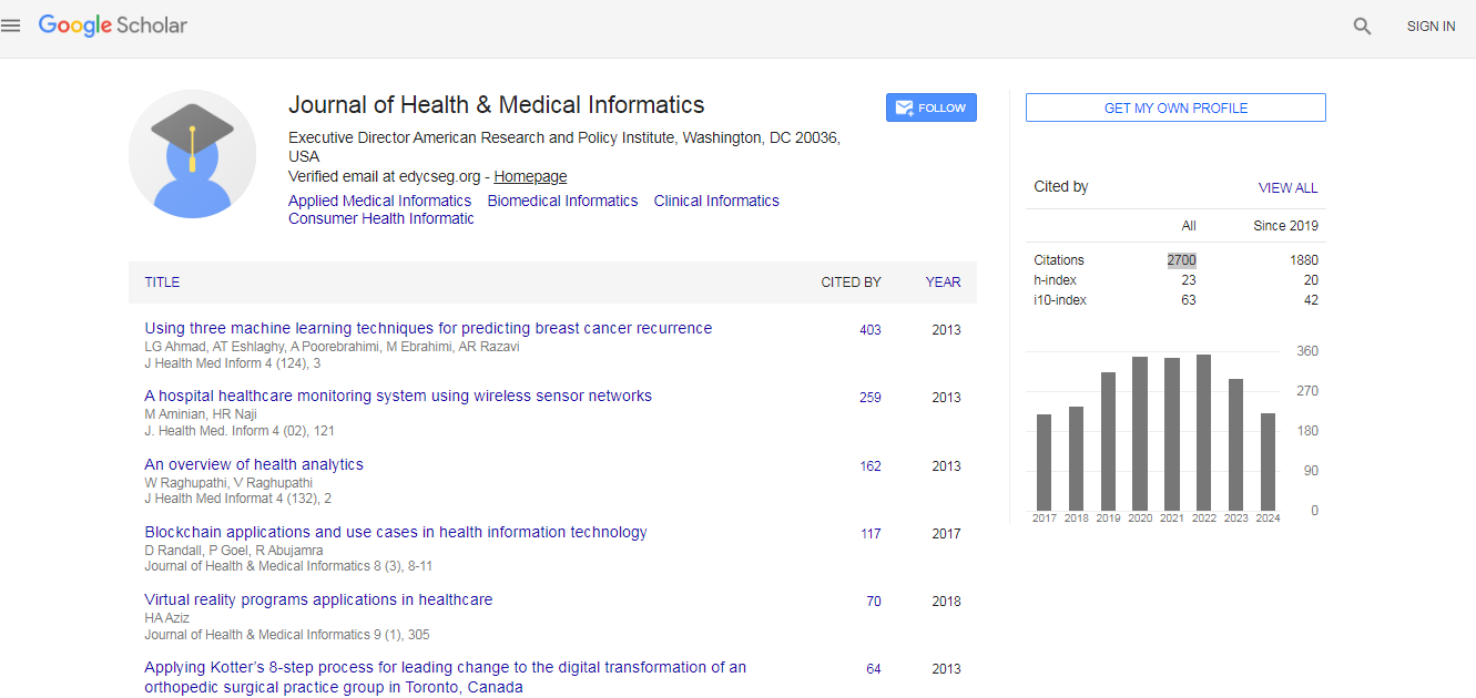
Journal of Health & Medical Informatics received 2700 citations as per Google Scholar report